Raising the BAR on Design
The changing face of BAR

Making piles of rocks and broken pottery look appealing can be difficult. But we have been fortunate in our long-time partnership with designer Robert Sugar and his studio, AURAS Design. Every other month they take our raw materials and turn them into an attractive and accessible magazine. On this occasion we let Rob share some of his favorite moments and challenges designing BAR.
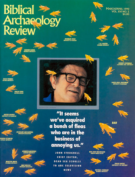
I wasn’t the first person to design BAR, but I have worked on it for 32 of its 34 years, including four redesigns. Each time we do a redesign, we try to find better ways of engaging our readers.
When I met Hershel Shanks, I was still in college, and he was a crazy lawyer who thought it would be easy to start a magazine. Since no one told him that was a ridiculous idea, he did it anyway.
The initial horrible BAR design was essentially Hershel’s. The cover was supposed to represent the two Tablets of the Law supporting something that was supposed to look like the shape of the famous Siloam Inscription. It was executed by Barbara Levine, the wife of one of Hershel’s lawyer friends.
Already a library member? Log in here.
Institution user? Log in with your IP address.

